Project

Zio Frank Pasta

Project

Zio Frank Pasta

Pasta that loves you back.

Strategy

Branding

Creative Direction

Design

UX / UI

Illustration

Packaging

Challenge

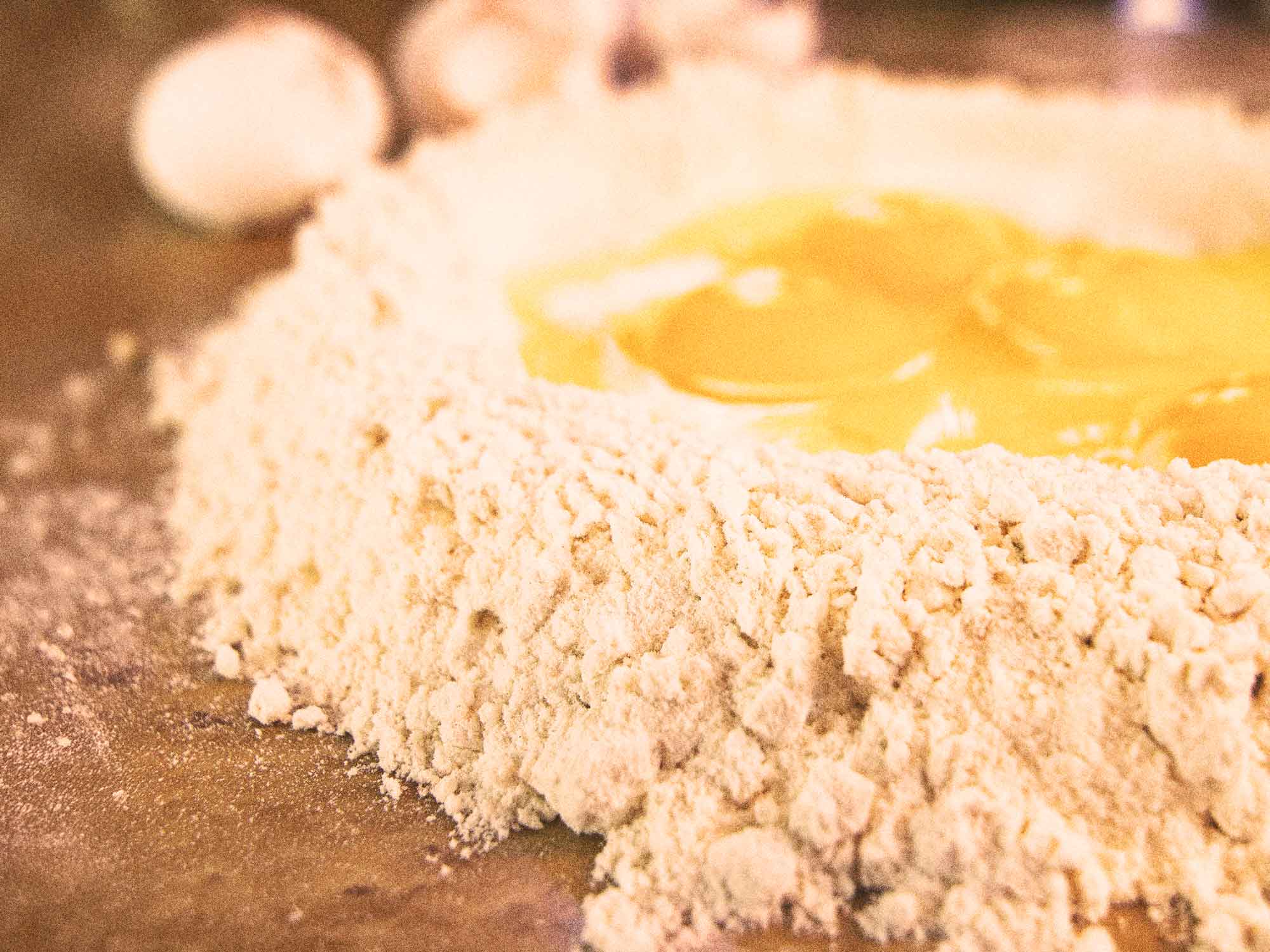
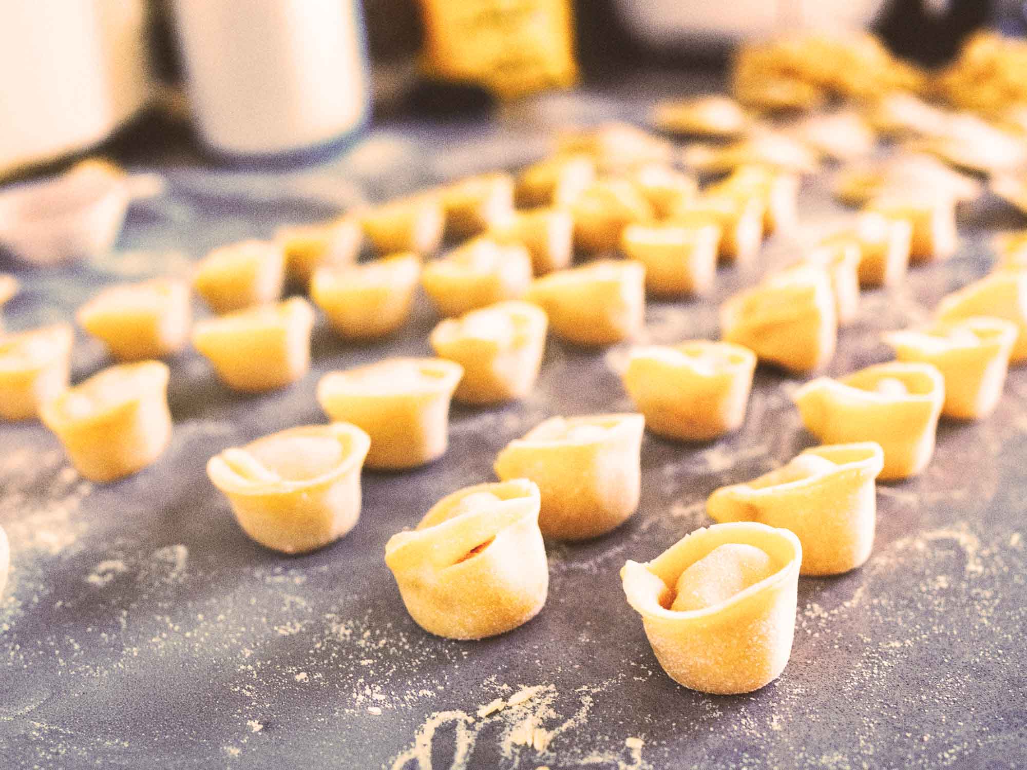
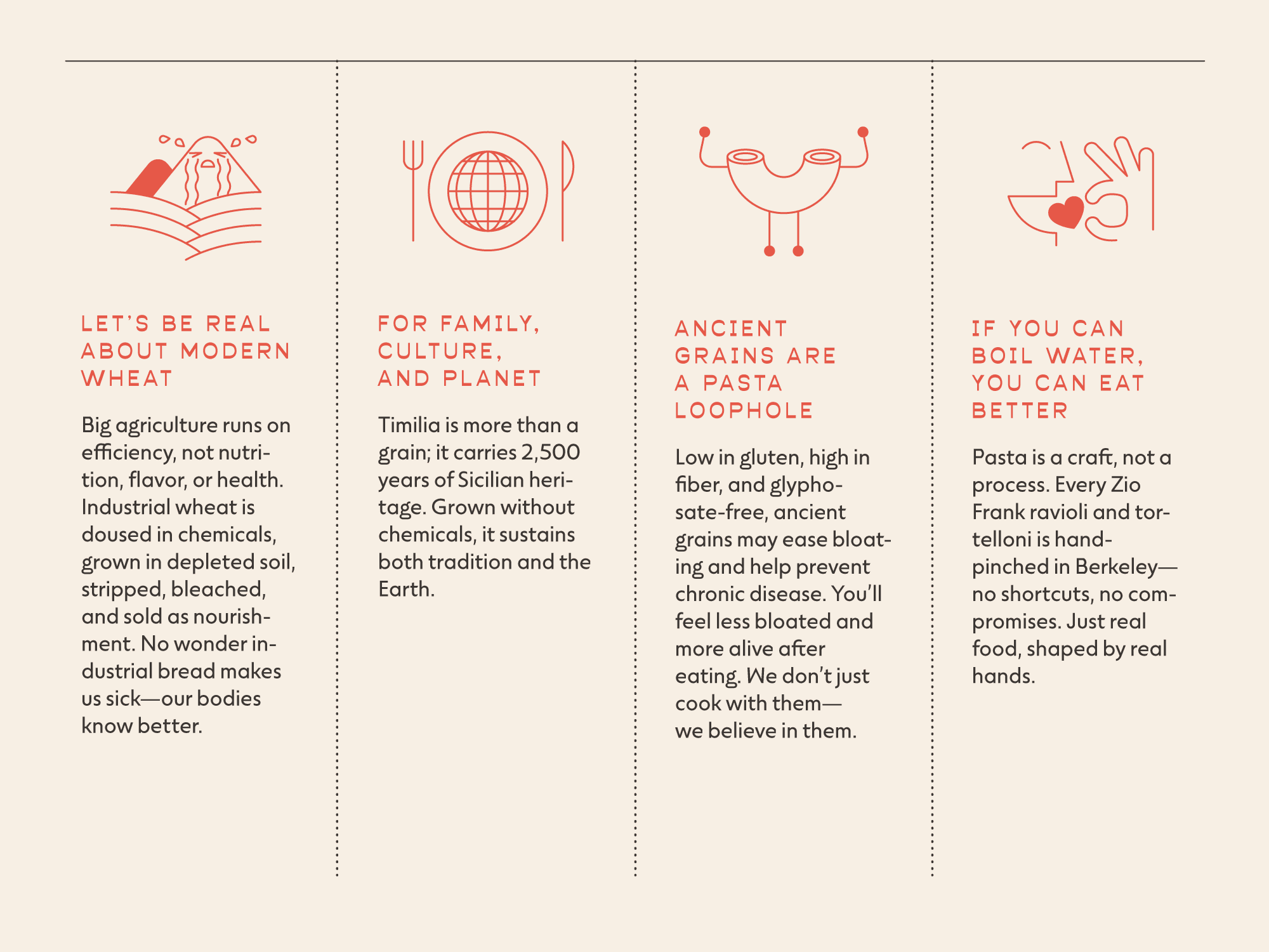
“Uncle” (Zio) Frank Lo Coco, third-generation owner of Berkeley's beloved Lo Coco's Sicilian restaurant (established 1983), wanted to extend his family's 60+ year culinary legacy into a retail pasta and flour brand. The challenge was translating the authenticity and quality obsession of a family restaurant—known for using Sicilian ancient grains Timilia and Russello—into packaging and brand identity that could compete in specialty food retail and honor Italian tradition. 

Above all, the brand needed to communicate both heritage and health benefits: ancient grains that are easier to digest, nutrient-dense, pesticide-free, and culturally significant.

Process

I worked with Frank over about 10 months to develop the complete Zio Frank brand identity, packaging for frozen pasta products, and an ecommerce/wholesale website. We wandered through different visual directions—some leaned too rustic, others too modern, others too playful—before finding the balance of traditional Italian food branding with a friendly, contemporary feel. 

We also had to break rules about typical Italian specialty food packaging: instead of the expected artisanal earth tones and script fonts, we used bold geometric shapes, bright colors, and a playful logo that felt more like a modern design brand. The packaging had to work in freezer cases, communicate the ancient grain story quickly, and stand out in specialty retail. We committed to a system that could scale from simple wholesale packaging to consumer pouches (ravioli, tagliatelle) to future product, building brand architecture that honored the Lo Coco family legacy while establishing Zio Frank as its own entity.

Process

Impact

The brand launched to wholesale restaurant clients with exceptional response, leveraging Lo Coco’s reputation for quality Italian cuisine. The packaging and brand system positions Zio Frank for expansion into specialty retail while maintaining the integrity and health-focused mission that have made Lo Coco family restaurants a Bay Area institution across four family locations.

Impact

The brand needed to communicate both heritage and health benefits.

The brand needed to communicate both heritage and health benefits.

The brand needed to communicate both heritage and health benefits.

We had to break the rules of “classic” Italian food packaging, using modern shapes, colors and icons to communicate the ancient grain story.

We had to break the rules of “classic” Italian food packaging, using modern shapes, colors and icons to communicate the ancient grain story.

We had to break the rules of “classic” Italian food packaging, using modern shapes, colors and icons to communicate the ancient grain story.

Lorem ipsum dolor sit amet, consectetur adipisici elit, sed eiusmod tempor incidunt ut labore et dolore magna aliqua.

Lorem ipsum dolor sit amet, consectetur

More Projects